Yan Pritzker asked me for some UI suggestions for Planypus, his social event-planning website. I thought it would be fun to give it a makeover. (It was Friday night, and I was social event-less myself. Sigh.) The original is here, and the redesign is below.
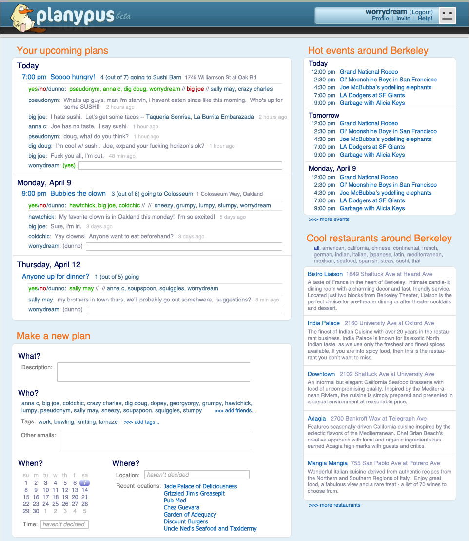
The current planypus design has five primary pages: plans, city, friends, make a plan, individual activity. The design above is a little gutsy -- it tries to put all of that on one page. That is, almost all activity occurs in a single, consistent view. (Profile, help, about us, etc. would be separate pages.)
The left side is user-related stuff. The right side is city-related stuff. I'll start with the right, since that's less crazy.
Pretty straightforward. I grouped by day and toned down the graphic design. Separator bars and candystripes are only useful for long lists. If each section of a list has a small number of items (maybe less than 10-ish?), just list them.
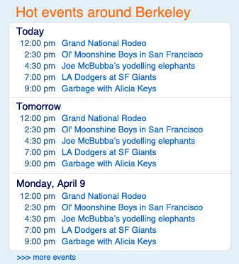
The "more events" link updates the panel in place, like the "more restaurants" link on your site. Providing a scrollbar instead might be even better.
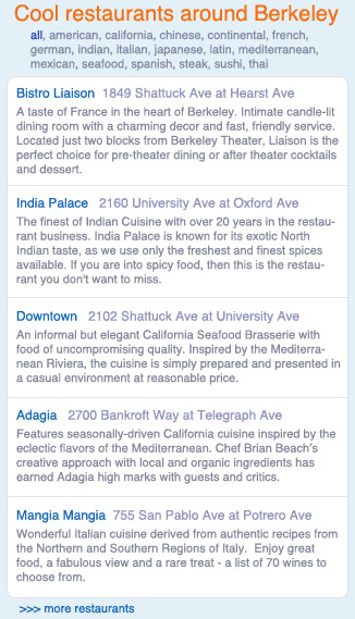
Don't hide cuisines behind a drop-down. They're fun to browse.
A two-column table layout, as on your site, wastes space and makes it hard to skim. For skimming, you want a one-dimensional path that the viewer's eyes can follow to pick up all interesting information. Interesting information here might be the restaurant's name and the first half-dozen words of the description. With your design, the viewer's eyes have to zig-zag across the columns. With this design, it's almost a straight vertical down the left edge of the panel.
Cross-streets are super-awesome, but probably out of your reach.
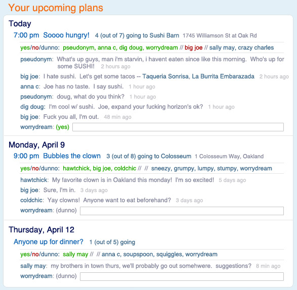
I'm no expert at social software (is anyone?), but I like to think of this as the key principle: The fundamental unit of socializing is the conversation. Social software is structured around talking.
Obviously, you've thought about your application more than I have, but to me, things like voting for times and locations or editing a shared planspace are unnecessary structure. For a small group, consensus arises through talking. Just make it really, really easy for people to talk.
This section shows all upcoming activities, with the conversations associated with each. Putting everything associated with every upcoming activity all on the same page is gutsy. But what, are you going to run out of pixels?
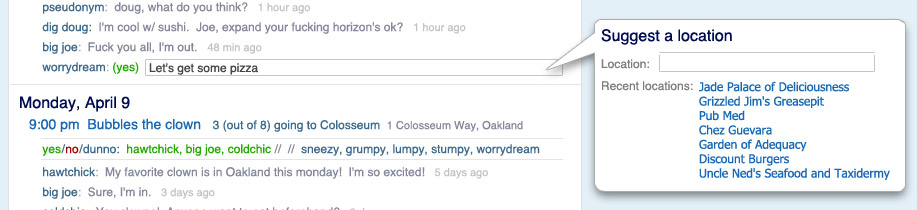
The user contributes to the conversation just by typing text into the appropriate box at the end of each conversation. (These conversations are in chrono order because reverse-chrono confuses me, but whichever the kids are doing these days is probably okay.) The text box sizes dynamically -- as it gets full, it grows another vertical line. Make it like IM -- submit when the user hits enter, show the updated conversation, and put the focus back in the new text box so the user can write more.
The user changes his yes/no/dunno status by mousing over the (yes) between his name and the text box, and choosing from the popup that pops up.
Notice that big joe has suggested some restaurants in his message. These are links -- users can click on them to get info about the restaurants. The organizer can click on one to set it as the activity location. There are a couple possibilities for how big joe puts those links there:
Or both.
Likewise, if someone writes a time in their message ("7:00 pm", or "7:00", or "7pm", or whatever), it is auto-linked. The organizer can click on it to set the activity time. Dates ("tomorrow", or "monday", or "the 6th") can be auto-linked as well, and the organizer can click on them to change the activity date.
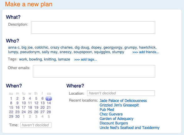
The description serves as the first post in the conversation. Ideally, the "headline" is also taken from the description (the first sentence or phrase) -- this is also gutsy, but I think people would catch on. It would be good to avoid the complexity of a separate box for headline.
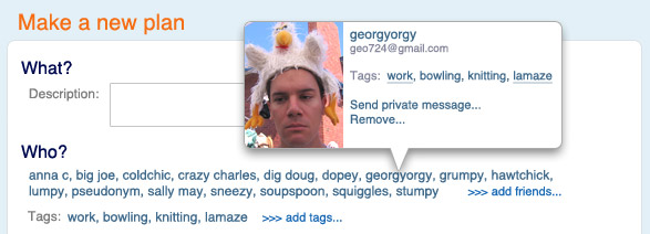
Friend management can happen directly within the "who" section. Mousing over a friend brings up a popup: