Visualizing Weights of Graph Edges
or: Two Great Graphs That Go Great Together
Bret Victor / May 10, 2011
This page presents an interactive method for visualizing activity on graph edges. The example used here is flux in metabolic pathways, but other applications include network traffic, electronic circuits, fluid flow, or anywhere it's important to understand the "hot paths" through a graph.
Background
A metabolic pathway is a chain of chemical reactions in a cell, whereby a particular chemical is converted into another.
![]()
In the example above, acetate is converted into phosphoenolpyuvate through two intermediate chemicals. The number above each edge refers to the enyzme that catalyzes that particular reaction.
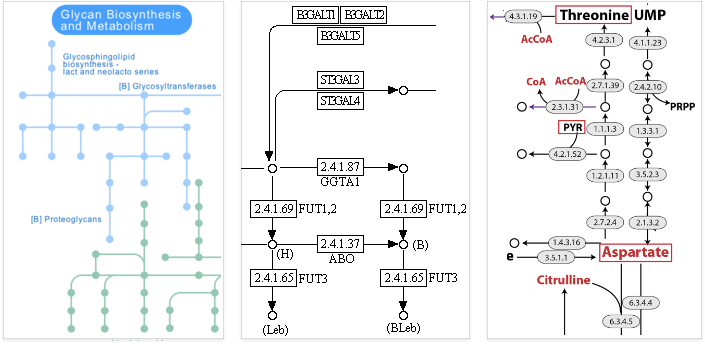
The set of pathways in a cell comprise a large network, which is represented by a graph with chemicals as nodes and reactions as edges. Here are a few typical renderings of these graphs:
Many problems of interest involve the rates of these chemical reactions, referred to as flux. At a given time, some pathways might be active, with high flux, and others inactive, with low flux. These fluxes are typically shown as weights on the edges of the graph.
Unfortunately, such numerical annotations don't allow us to understand the pattern of fluxes at a glance, or make visual comparisons.
Visualizing Fluxes
Our goal is to understand the pattern of fluxes across the graph. We would like to see at a glance which paths are active and inactive, as well as make precise visual comparisons between the edge values.
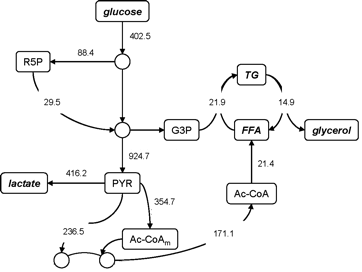
We'll start off with a graph in a standard (KEGG-like) style:
In this problem, we care only about the edges — the nodes are relatively uninteresting and have no quantities associated with them. We invert the focus in the above picture, switching to a rendering style that strongly emphasizes the edges.
This picture is essentially "built out of edges". The edges are now big, bold canvases that we can use to display information. First, we'll try conveying the information using color:
Edges with high values are red — this is a preattentive property that immediately draws the eye, and carves out the "hot path". Midrange values are black. Low values fade out to white, taking inactive paths out of the picture.
Next, we vary the line width according to the value as well:
The nodes have also been omitted entirely; they are implied well enough by the segment joins, and we don't need their distraction. The graph is now in good shape for qualitative understanding — the active and inactive paths are very clear. Next, we add quantitative annotations:
The numbers add some clutter, but because they are the same color as their nearby edges, we are able to see "over" them and still take in the qualitative patterns at a glance.
The colors allow us to make rough visual comparisons, and the numbers allow us precise symbolic comparisons. But the ideal for any visualization is precise visual comparisons, of the sort provided by a bar chart or scatterplot. Unfortunately, precise visual comparisons require a common baseline — this is the everpresent challenge when designing a comparison of objects with fixed spatial positions.
The trick that we'll try here is to go ahead and use a bar chart as well, and then tie together the chart and graph with some lightweight interaction.
The bar chart lists the edges of the graph, sorted by weight and using the same color scheme. This allows us to see the distribution of weights at a glance, and allows us to make precise visual comparisons of the values — we can see exactly how the values differ, and by how much.
Try moving the mouse over the bar chart. The edge that you are over is highlighted in blue, and edges with lower values are hidden. You can see the subset of "active paths" for whatever threshold of "active" you choose. And by rolling the mouse up and down the bar chart and watching how the graph edges pop in and out, you can get a precise understanding of how the edge values are ordered.
Try clicking and dragging up and down the bar chart. Only the subset that you have dragged over is shown. This allows you to concentrate on a particular range of edges, such as only the midrange values, or some cluster of interest.
These lightweight interactions tie the two visualizations together so they can be explored simultaneously, and insights from the chart can be localized to the corresponding locations on the graph.
Future Work and Acknowledgements
What we've seen here is a visualization of a static (non-time-varying) arrangement of weights. In a future installment, we'll look at how to incorporate the time dimension into this visualization and explore dynamic solutions.
Many thanks to I-Chun Chou's team at the Voit lab for Biological Systems Analysis at Georgia Tech, for suggesting and discussing this problem with me.
Thanks also to Ali Mazalek's team at the Synaesthetic Media Lab at Georgia Tech — their Pathways project got me thinking about pathways in the first place.