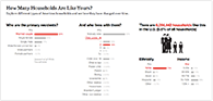
Who are the primary residents?
Any
Married couple
Single female
Single male
Male/female unmarried
Male partners
Female partners
(percent of )
 This page presents a brief critique and fully-working redesign of a recent New York Times interactive graphic. The redesign emphasizes showing and comparing the data, and exploring the data through simple, powerful interactions.
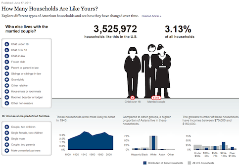
The New York Times recently published an interactive graphic for exploring different types of American households. Go check it out.
Given this household data, here are a few straightforward questions that one might be curious about:
Play with the above graphic to understand how it makes answering these questions, and questions like them, tedious or impossible.
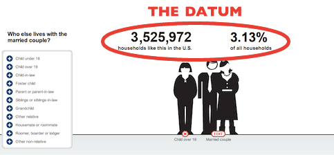
The essence of data graphics is visual comparisons. In the graphic above, the data is not visual, and can't be compared.
The data can't be compared because, of the millions of numbers in this dataset, only one is displayed at any given time.
To switch out the number shown through this peephole, the reader must interact. In this case, through a particularly convoluted navigation scheme, with no clear information hierarchy, peek-a-boo menus that appear and disappear, and "actions at a distance" — clicking the menu causes a far-away image to change, and clicking the image causes the menu to change.
But the confused navigation scheme is not the primary problem. The problem is that significant navigation is required at all. The reader must interact constantly. The reader must beg the graphic for every scrap of information.
The essence of data graphics is visual comparisons. An excellent graphic offers its information generously and eagerly, encouraging the reader to answer wide-ranging comparative questions at a glance. An excellent interactive graphic offers opportunities to explore the data space more precisely, to slice and filter the data, to see the data from specific perspectives. Interactivity should not be used as a barrier to information.
Here is a redesign. As you explore it, try answering the questions above.
Both the information design and the interaction design are very simple and consistent. There are bar graphs. The bar graphs show distributions of data. Clicking a bar filters the data. That's all.
The graphic provides information right off the bat. Even before we first interact, we can see the distribution of primary resident types. This data can inform our interaction — we may be surprised, for example, at the small proportion of unmarried couples, and choose to learn more about these households.
Notice that every interactive element is informational. The bar graphs do double-duty, displaying data as well as providing a means to filter data. In particular, the Ethnicity and Income graphs show distributions as in the New York Times graphic, but also allow the reader to slice the data in powerful ways — to constrain the entire graphic to only Asian households, for instance, or low-income households. No extra pixels were spent to offer this slicing feature. No UI buttons or controls clutter up the graphic. Instead, the feature is offered simply by making the Ethnicity and Income graphs consistent with the other two graphs — click to filter.
Every click can potentially reveal a large amount of new data. This makes the interactions powerful, meaningful, and worthwhile. There is no gratuitous interaction. Every click is rewarded.
The second chart ("And who lives with them?") uses an unusual form of multiple selection. For any of the categories, such as "child under 18", we also need to specify a quantity — how many children under 18. The solution to this design challenge came simply from being informational and consistent. We want to see the data for "any children", but we also want to see the data for "1 child", "2 children", etc. So, we show them all as bar graphs, with the distribution of children expanding out when we click on the "any children" bar. Interaction-wise, we assume that the reader probably wants to specify one child, so we simply select that immediately. If the reader wants more, the other options are a click away.
The design as a whole is very stable — once a chart appears, it's there for good. Nothing moves around, nothing goes away. This allows the reader to take in and grasp the layout of the information space, and quickly explore new ideas without "navigation" getting in the way. (The so-called "progressive disclosure", wherein the charts are introduced one-by-one, is simply to prevent the casual reader from being overwhelmed by the graphic and skipping over it. With a sufficiently sophisticated or motivated audience, progressive disclosure shouldn't be necessary.)
A very powerful technique not shown here is filtering on rollover instead of click. This would allow the reader to skim the mouse over a graph and quickly see the data sliced in every possible way — a huge information payoff for little interaction. This technique was not used in this case because it was awkward to integrate with the multiple-selection chart. But in general, it's a very good technique.
Show the data. Compare the data. Let the data guide the reader's interactions.
The essence of data graphics is visual comparisons. This is still true for interactive graphics. Design a graphic that informs even when completely static. Then use interactivity — judiciously, powerfully, consistently — to subset the data space according to the reader's interests.
Don't make interactivity a barrier to information.
Two excellent resources on the design of data graphics are Edward Tufte's Visual Display of Quantitative Information and Stephen Few's Show Me the Numbers. Both books are about static graphics, and everything they say applies equally well to interactive graphics. For an especially analytic treatment of graph design, see William Cleveland's Elements of Graphing Data.
For much more about where interactivity fits into information design, see Magic Ink.
This work is (tangentially) part of the Explorable Explanations project, which is about introducing subtle interactivity into information, to encourage active reading.
The redesign was built with Tangle, the JavaScript library for authoring reactive documents.
Thanks to Adam Wride (@adamwride) for suggesting the New York Times graphic.